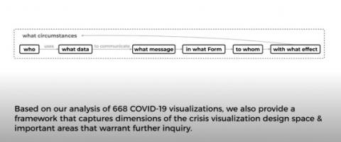
In response to COVID-19, a vast number of visualizations have been created to communicate information to the public. Information exposure in a public health crisis can impact people's attitudes towards and responses to the crisis and risks, and ultimately the trajectory of a pandemic. As such, there is a need for work that documents, organizes, and investigates what COVID-19 visualizations have been presented to the public. We address this gap through an analysis of 668 COVID-19 visualizations. We present our findings through a conceptual framework derived from our analysis, that examines who, (uses) what data, (to communicate) what messages, in what form, under what circumstances in the context of COVID-19 crisis visualizations. We provide a set of factors to be considered within each component of the framework. We conclude with directions for future crisis visualization research.

